AI Summary:
Employee productivity reports turn everyday work data, attendance, activity, and application usage, into insights managers can actually use. Most teams still rely on scattered spreadsheets and gut instinct to judge performance, which rarely holds up once questioned. This blog breaks down what a complete productivity report should include, how it differs from basic time tracking, and how managers turn that context into fairer reviews, better workload planning, and tighter cost control, without tipping into surveillance.
When payroll, client billing, attendance, and workforce planning depend on manual timesheets or manager estimates, small reporting gaps can become expensive operational problems.
Missed clock-ins can affect payroll. Unrecorded work can reduce billable revenue. Uneven workloads can lead to overtime, missed deadlines, or employee burnout. For remote, hybrid, and offshore teams, these issues are often difficult to identify until they begin affecting margins, client delivery, or employee trust.
Employee productivity reports give operations, HR, and finance leaders clearer visibility into working hours, attendance, workload distribution, and time allocation. Used correctly, they help improve payroll accuracy, protect billable revenue, identify workload imbalances, and support better workforce planning.
The goal is not to monitor every employee action. It is to help decision-makers act on reliable data rather than assumptions.
Employee productivity reports show managers where work time actually goes, active hours, idle time, focus, attendance, and application use, so decisions run on evidence instead of guesswork.
Most organizations still don’t have that: work gets judged through spreadsheets, status meetings, and manager instinct, an approach that holds up for a five-person team and breaks down for anything larger.
The gap shows up fast. A manager sees a productivity number drop and assumes effort dropped with it. A team looks on schedule while quietly burning through hours nobody budgeted for. Without reliable employee productivity reports, these calls get made on instinct, and instinct doesn’t scale.
This blog breaks down what a complete employee productivity report actually includes, how it differs from basic time tracking, and how managers use that data to fix workload imbalances, run fairer performance reviews, and catch cost overruns before they repeat, without tipping into surveillance.
An employee productivity report is a structured summary of how work time is spent, including active time, idle time, focus time, attendance, and application usage, organized so a manager can see patterns instead of a single unexplained number. It answers not just how long someone worked, but where the time went, how it changed over the week, and what it produced.
That distinction between activity and outcome is what separates a useful report from a number nobody trusts. A report that only shows “84% productive” invites debate. A report that shows 84% productive, 65% of that time spent on core work, 15% in meetings, and a clear trend line compared to last week invites a decision instead.
A complete employee productivity report combines four elements, not one score in isolation.
Attendance and availability:
Present and absent days, late arrivals, leave records, and department-wise attendance trends, read alongside actual output, not as a standalone compliance number. A late start is irrelevant if the work still lands on time. For more on why attendance alone isn’t enough, see attendance sheet templates vs. productivity tracking.
Session-level detail, not just a daily score:
A day isn’t one number. It’s a sequence of sessions: active stretches, idle periods, offline gaps, regularized entries. Reconstructing the workday session by session shows when a team is genuinely focused versus when a “productive” hour was really three interruptions stitched together.
Where time actually goes:
Application and website usage, categorized against what each team actually does. A developer’s editor isn’t the same “productive” category as a designer’s creative suite. Generic productive/unproductive buckets miss this; configurable categories don’t.
Patterns over time, not single-day snapshots:
Activity heatmaps and productivity trends across days or weeks reveal when teams are naturally most engaged, so managers can protect focus hours and schedule around them instead of guessing.
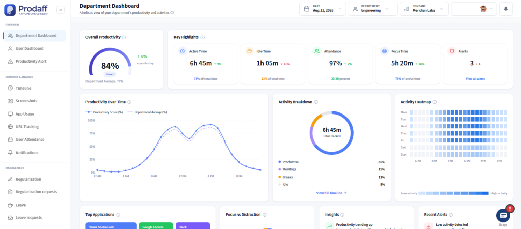
Put those four elements on one dashboard and a report stops being a screenshot of last Tuesday and starts being a live signal, showing whether Tuesday was an outlier or the start of a pattern worth acting on.
That matters most for hybrid, remote, and distributed teams, where a manager can’t rely on walking past a desk to gauge how a day is going.
Basic time tracking records hours worked. A real employee productivity report explains how those hours were spent and what they produced.
| Basic Time Tracking | Employee Productivity Report |
Records | Clock-in / clock-out, total hours | Active time, idle time, focus time, attendance, application usage |
Structure | Single daily total | Session-by-session breakdown across the workday |
Context | None, just a number with no explanation | Trends over time, department benchmarks, categorized application data |
Best for | Invoicing, payroll confirmation | Workload planning, resource allocation, performance conversations |
Examples | Hubstaff, Toggl, Clockify, Time Doctor, TimeChamp, Teamwork, Apploye, Everhour | Prodaff |
The market isn’t short on time-tracking tools, and the ones above all log hours competently. Several add screenshots or a basic activity score on top. That’s genuinely useful for a freelancer invoicing a client or a small team confirming hours worked.
It runs out of road once an organization is managing multiple departments, client accounts, or a distributed workforce across time zones. At that scale, a timesheet and an activity percentage don’t answer the questions that actually matter: Is this account quietly over budget on hours?
Is this team overloaded or just disorganized? Is a productivity dip a real problem or three days of unavoidable client escalations?
That’s a reporting problem, not a tracking problem. Screenshot-heavy monitoring can also read as surveillance even when that’s not the intent, because it captures moments without the surrounding context.
A report built from attendance, session history, and categorized application data tells a fuller story. It can show that an employee’s activity looked “low” because they were deep in a single document for two hours, not because they stepped away.
The gap widens further with configurable categories. A generic “productive apps” list treats every team the same way, which rarely holds up in practice: a code editor isn’t a distraction for a developer, and a design tool isn’t idle time for a designer.
Reports that let each department define its own productive applications end up far more accurate than a one-size-fits-all list, and far more defensible when a manager has to explain a number to the person it’s about.
Employee productivity reports improve decisions by replacing a single assumption with the full context behind it, which changes what a manager does next, not just what they know. Gallup’s research backs this up directly: managers who tie performance to outcomes rather than hours or visibility get a clearer, fairer read on their teams.
Take a customer support team whose productivity drops for three straight days. Without context, the easy conclusion is that people are checked out.
With a full report covering attendance, timeline history, application usage, and focus patterns, the real story often looks different: the team spent those days handling an unusual spike in escalations, not working less. Guesswork leads to a warning conversation. Evidence leads to redistributing the ticket queue.
The same pattern shows up in resource allocation. Two employees can each log eight hours; one spends seven of them on priority work, the other loses three to app-switching and fragmented tasks. A timesheet shows equal effort. Session-level data shows the real capacity gap, in time to act on it.
It shows up in performance reviews, too. Remote employees are especially exposed to recency bias, so a factual record of attendance, focused time, and workload against role expectations gives both sides a starting point that isn’t just a manager’s impression of a good week or a bad one.
And it shows up in cost control. Consistent gaps between planned and actual project hours usually mean weak scoping, not a slow team, a pattern historical trend data catches before it repeats across the next five client engagements.
Activity heatmaps add one more layer to this. Instead of asking employees when they’re most productive, a heatmap shows it directly: which hours a team is consistently most active, and which stretches are reliably quiet.
That’s enough to protect a team’s peak hours from being filled with meetings, and to stop scheduling important calls during a natural low point in the day.
Five metrics cover most of what a manager actually needs, without turning the dashboard into noise.
Metric | What It Shows |
Overall productivity score | Useful mainly in comparison, benchmarked against a department average rather than viewed alone |
Active vs. idle time | Separates genuine work time from time logged but not spent working |
Focus time | Uninterrupted stretches on productive applications, since fragmented attention rarely shows up in a simple hours total |
Attendance rate | Tracked alongside productivity rather than as a separate compliance checkbox |
Trend direction | Whether productivity is climbing, flat, or sliding compared to the department average over the past week or month |
Reports that surface these five in one view, rather than across five separate exports, are what actually get used day to day instead of pulled up once a quarter. For a deeper look at turning these into team-level goals, see our guide on creating meaningful productivity KPIs.
No. Surveillance focuses on watching individuals; a good productivity report focuses on understanding patterns, workload, and outcomes, with employees aware of what’s tracked and why.
The line isn’t the data collected; it’s the transparency around it, a point SHRM’s guidance on workplace monitoring makes clearly: employees are far more accepting of tracking when they understand what’s collected and why. Activity percentages and screenshots, used without context, tend to build resentment instead of trust.
The same data, read alongside task ownership and team collaboration, supports a fairer conversation instead of a defensive one. Lower activity during a week full of client meetings or training isn’t a red flag; it’s context a good report should surface, not hide.
Modern workforce management requires more than attendance records or timesheets. It requires visibility into productivity trends, work patterns, focus time, application usage, and operational performance that helps leaders respond with confidence.
Prodaff brings attendance, session-level timeline analytics, activity heatmaps, configurable focus-versus-distraction tracking, and productivity alerts into one dashboard, connected to QuickBooks, Jira, Salesforce, Keka HR, Zoho People, and Sage HR, so the data stays tied to payroll and project systems instead of living in a spreadsheet.
Start your 14-day free trial today and discover how Prodaff’s workforce analytics software helps your organization transform detailed reports into smarter, data-driven decisions.
At minimum: active and idle time, focus time, attendance, productivity trends over time, and application usage broken down by category. The most useful reports also include session-level history, not just a daily total.
Trends matter more than single days. Weekly review catches real patterns without reacting to one unusual afternoon; alerts for significant drops are worth checking as they happen.
Yes, and arguably matter more there. Remote teams lose the informal visibility of a shared office, so attendance and activity data fill that gap, as long as they're read alongside actual workload, not treated as a standalone verdict.
They're accurate for measuring patterns, not intent. A report can reliably show active time, focus time, and attendance trends, but it can't tell you why a number changed, so it works best paired with context a manager already has, not as a standalone verdict.
An employee productivity report is ongoing, data-driven, and factual; a performance review is periodic and includes judgment, goals, and qualitative feedback. The report gives a manager evidence to bring into the conversation; it isn't the conversation itself.